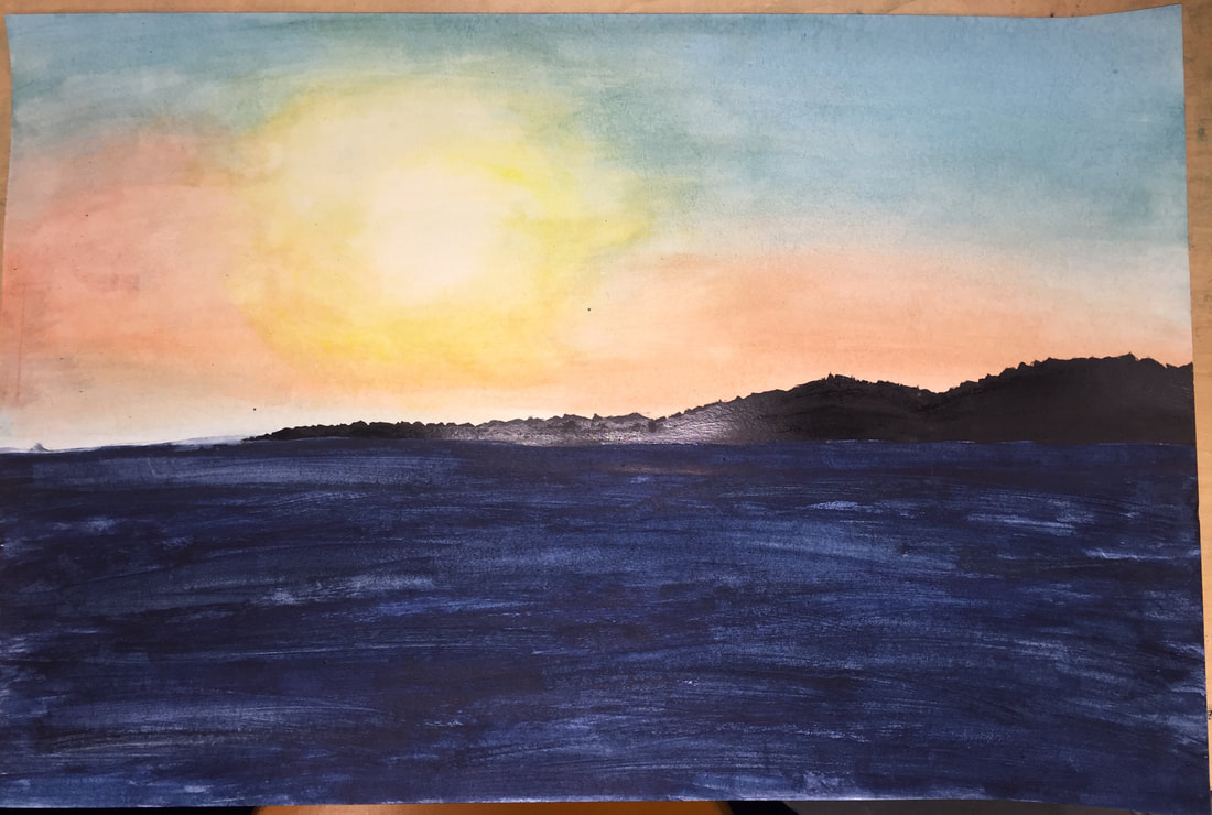
 perspective warm up 1. I used one point perspective. 2. I took this picture during a cruise. We were at dinner and the restaurant had glass windows and the sunset looked really pretty and you could see the land in the background. 3. Creating realistic looking water was very difficult because creating texture and waves is harder whenever the colors are meant to blend out. 4. The warm ups helped me the most because i had not ever done watercolor before or learned about perspective so doing these allowed me to see what both of them were before just jumping right into the picture.
0 Comments
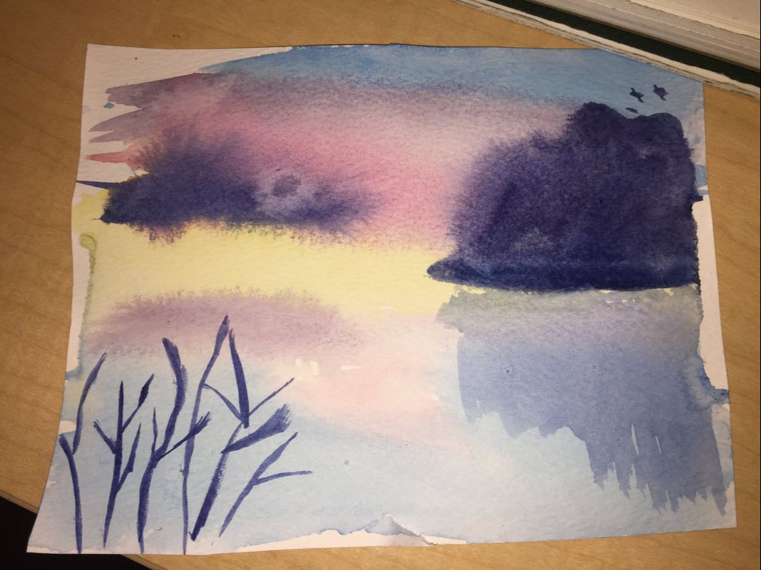
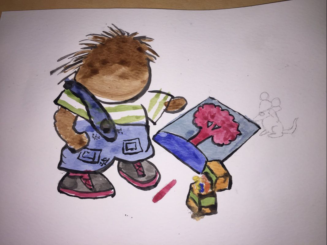
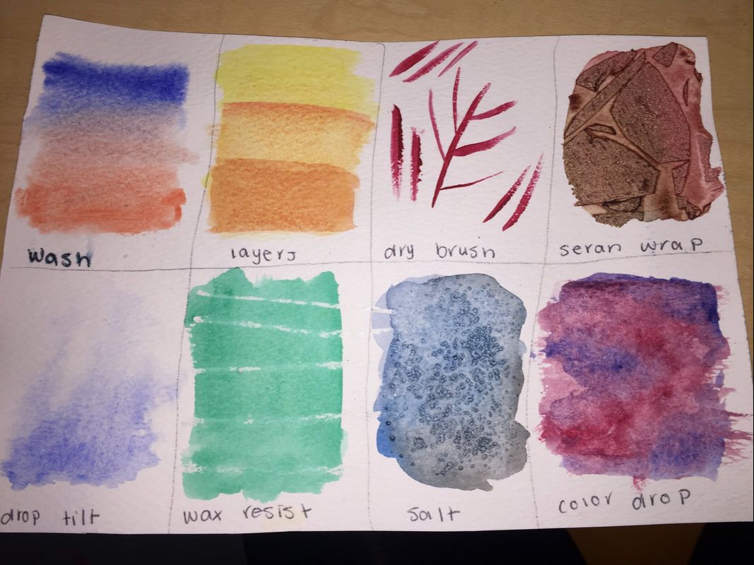 Watercolor techniques page 1. I thought that the illustration from a child's book was the most helpful. This was because it was the first time that we got to try and actually create a picture that you could actually understand. And with everyone doing it, we were able to tell each other what to add or fix. 2. My favorite thing about watercolor is how soft and delicate it looks in the end. It is easy to blend and sunsets can look very realistic with watercolors. 3. The most difficult thing about watercolor is creating white space, because in my piece there was some lighter areas and after I tried to leave them in I decided it looked really choppy so I just had to do it all the same.
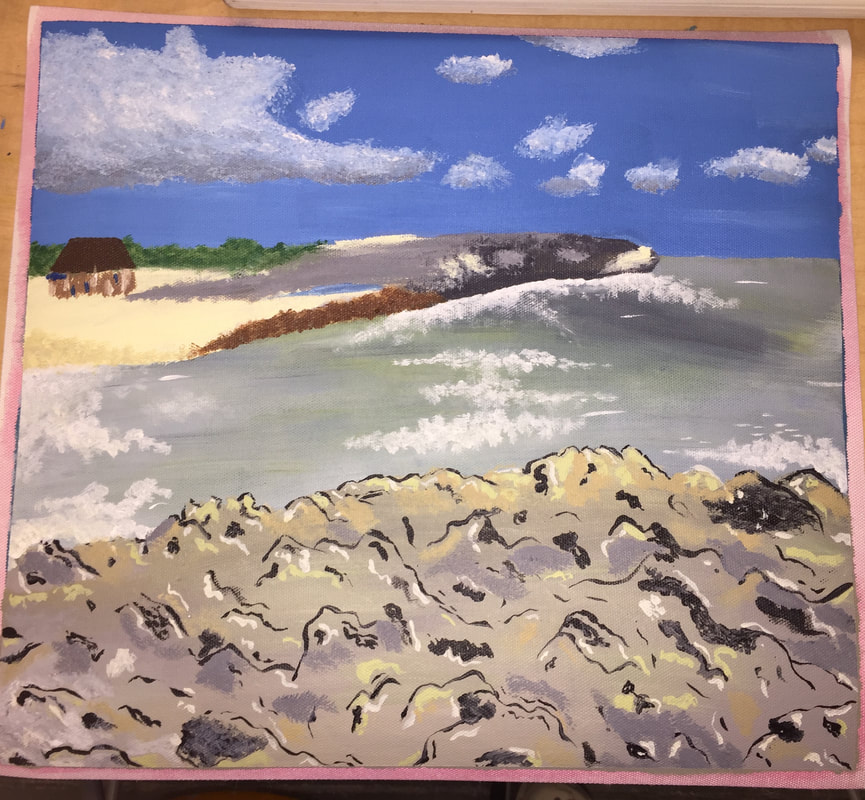
1. My painting is of a cruise I went on and we stopped and got off on an island. The water was so blue and the waves were beautiful. 2. The things I ran into the most trouble with during painting was making the texture of the rocks look real, being able to mix the right colors since a lot of mine were neutral or a tertiary colors, and just creating the right shapes in general. 3. I feel like the most successful thing in my piece is the blending. Most of my colors, specifically in the water, are well blended; I just really need to work on making everything look realistic. 4. I began working on my piece by putting down a general color in a general area of all my shapes. Then I worked on the water and attempting to blend the right colors in the right spots. After my water was done, I worked on adding more dimensions to the rocks in front of the picture and then creating a crisper line separating the water from the sky. Then, I added in clouds and did my best to create the rock/peninsula thing the goes out into the water which was very tricky.
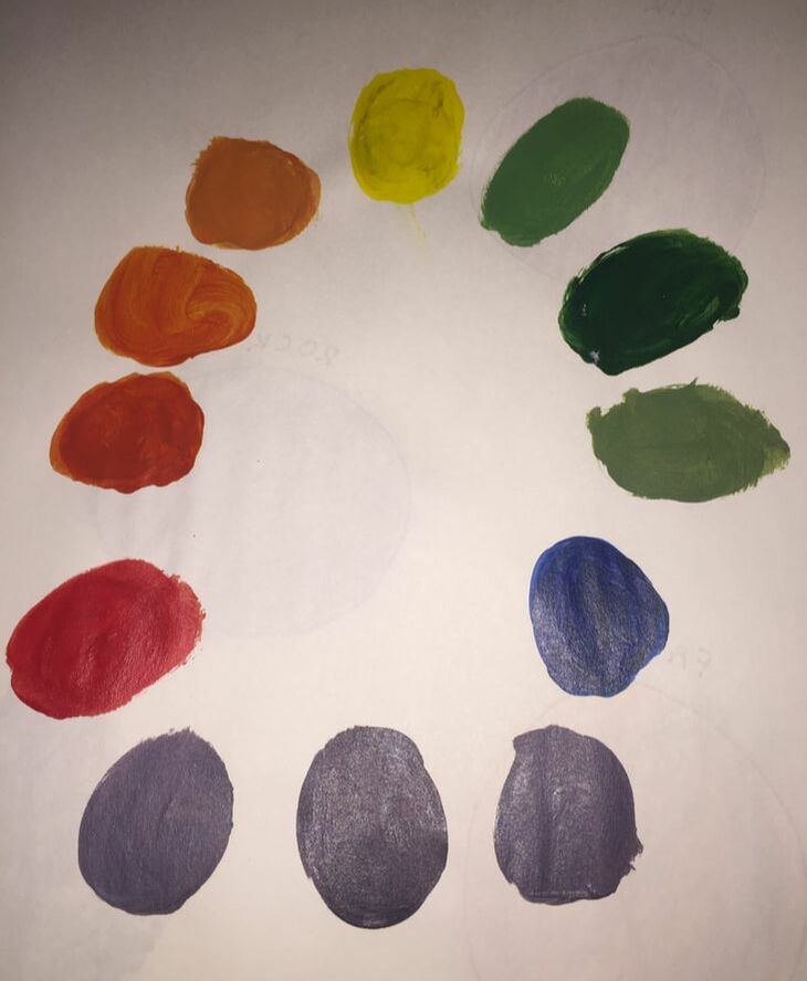
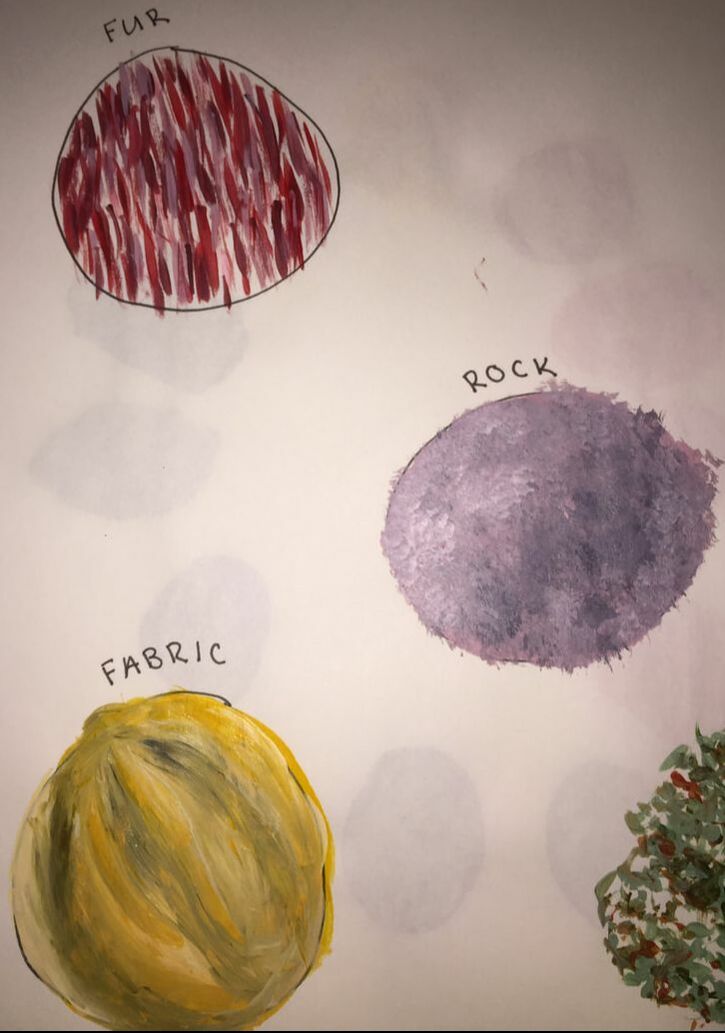
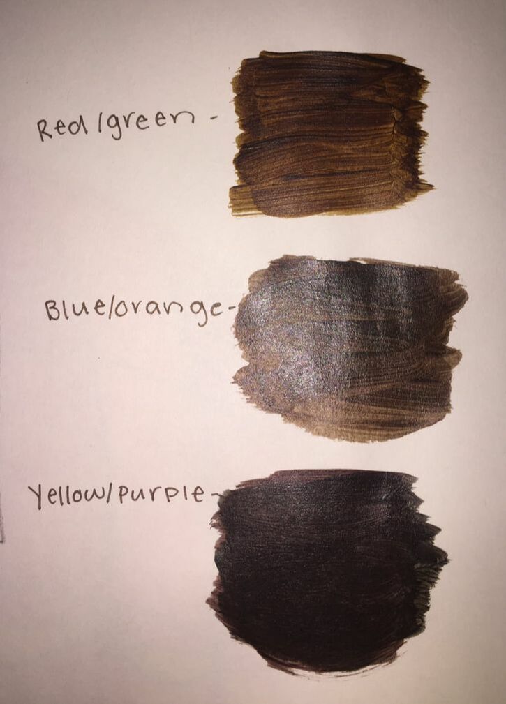
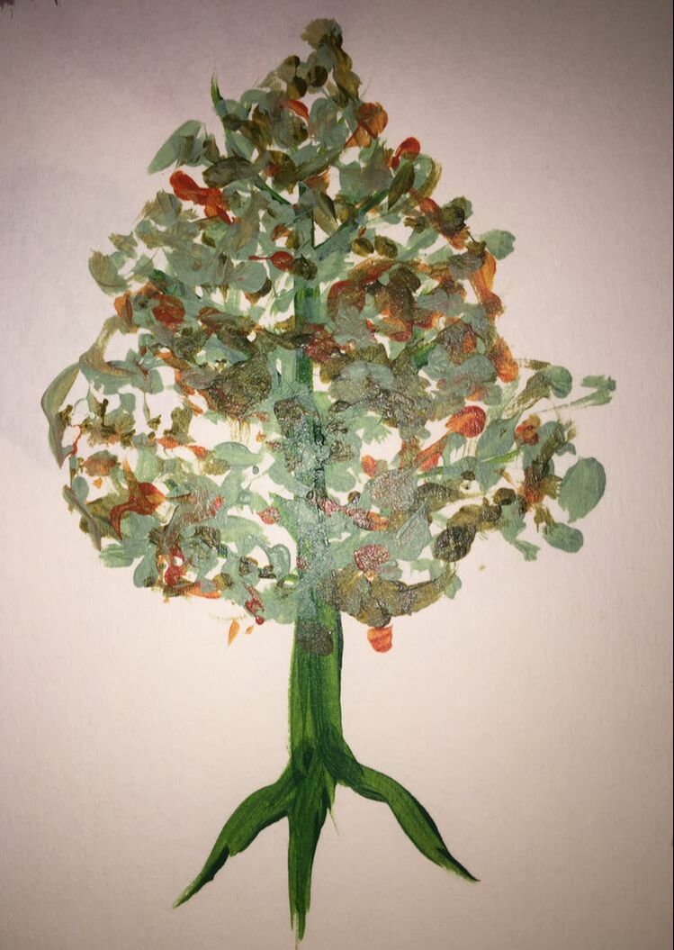
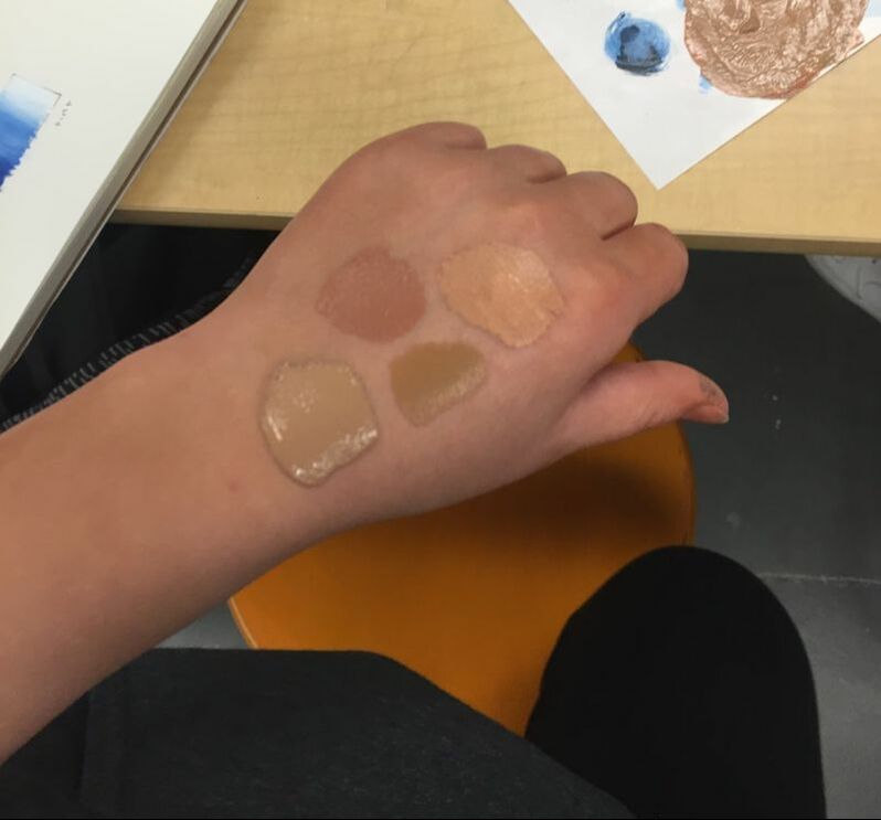
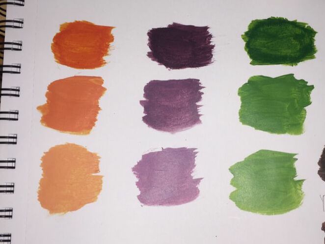
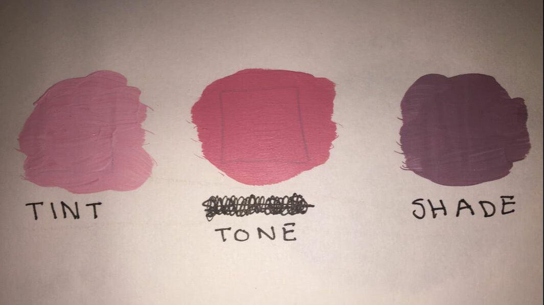
1. These different warm ups taught me how to create different textures and shapes. It also showed me how to mix certain colors to create different tints and shades of primary, secondary, and tertiary colors. 2. For me, the most helpful warm up was the learning how to paint a tree. It was something so simple, yet so many people struggle with making them look realistic, because they were never taught how to do it. Trees are something that show up in landscape paintings a lot, making them very important to know how to do. 3. I learned the most while trying to mix together skin tones; during this warm up I think everyone realized how difficult it was to find an actual realistic peachy color. Many of us made purples and pink or just creamy browns. I learned that skin tones begin as browns, but instead of only adding white you must add the colors of your undertones like maybe pink, yellow, or even green; this makes the color look much more realistic. 4. A few ways to make brown are by mixing the complementary colors, which are the colors across from one another on the color wheel. This technique is what we did; by mixing green and red, blue and orange, and purple and yellow, we were able to make three different types of brown. 5. If you would like to tone down a color, add a small amount of gray or an even smaller amount of the colors complementary color. Both of these methods will take the hue down to a tone which is thought to be more pleasing to the eye and bring the bright, pure colors down to a more sophisticated tone.
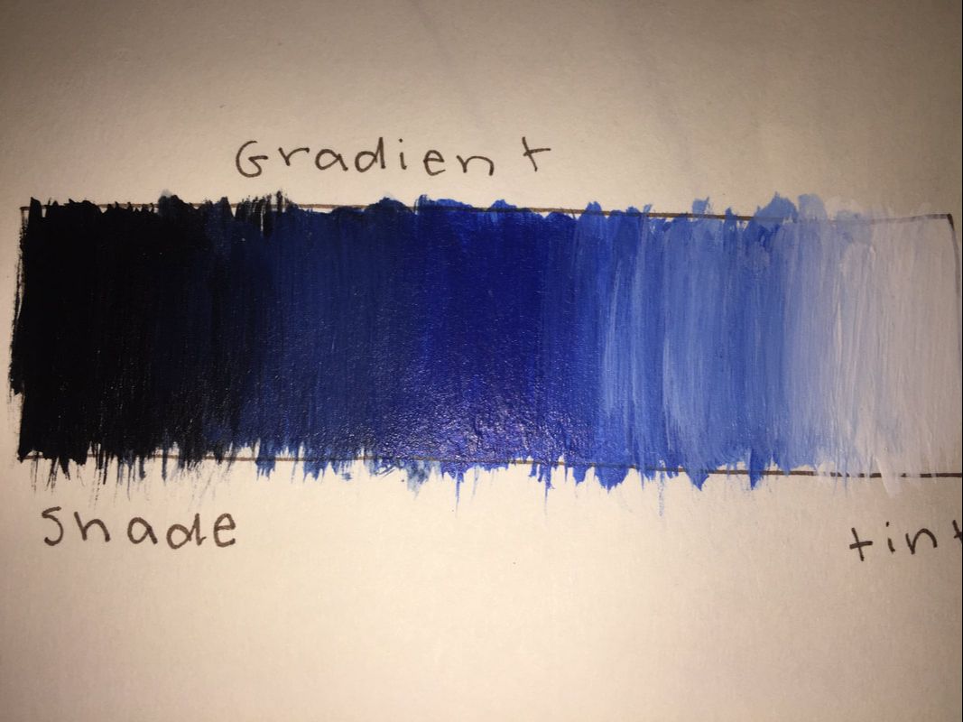
Composition is the placement or arrangement of visual elements or 'ingredients' in a work of art. And, value is the lightness or darkness of tones or colors in art.
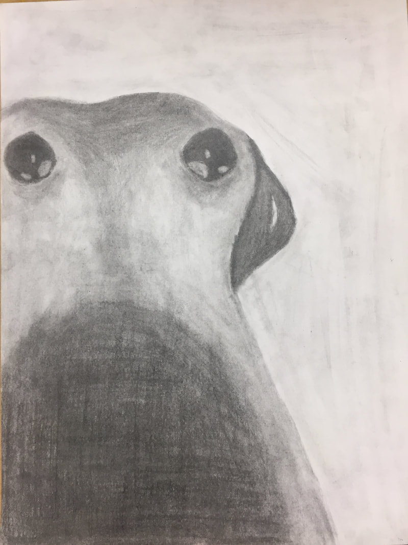
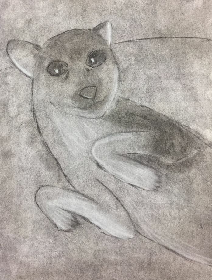
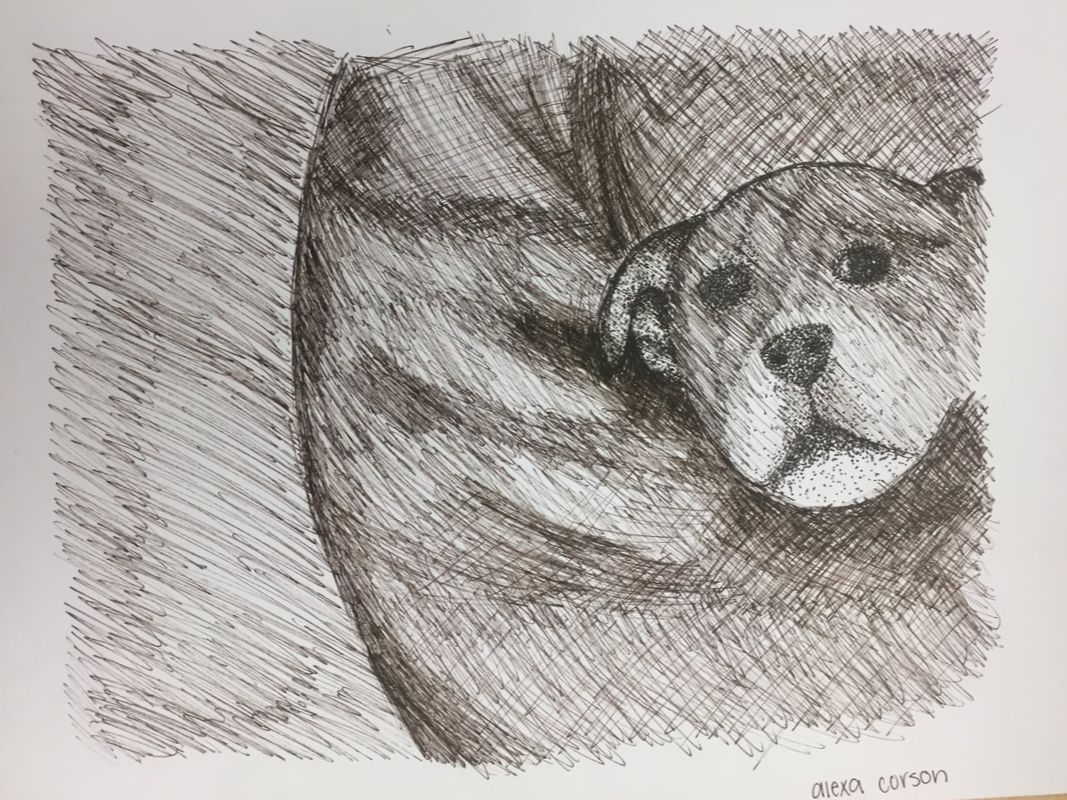 Pen drawing Pen drawing Pen was my favorite to do. Although you cannot erase with pen, it is very easy to just add more lines or dots over. Making creases and adding value was much easier with pen than any of the other mediums we used. 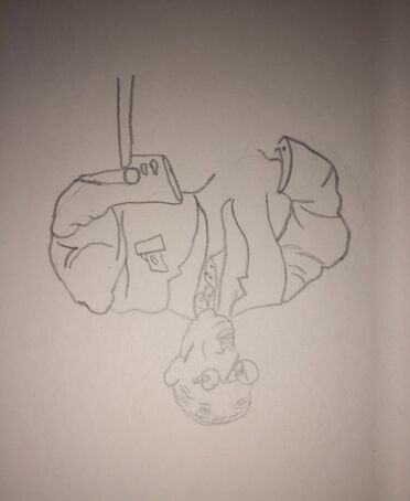 Most helpful warm up Most helpful warm up I believe this upside down Picasso drawing was the most helpful out of all the warm ups this unit, because it really forces you to look at shapes and proportions instead of just the idea of what you would be trying to draw. I had never thought of doing this before art class, but it actually is very helpful even if it may seem a little more challenging that drawing right side up. This technique helps very much to get the shapes in the picture down and I will use this tip in the future when I feel something is off about my drawing.
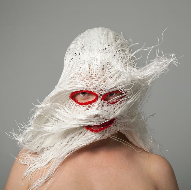
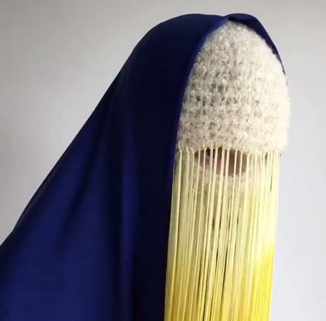
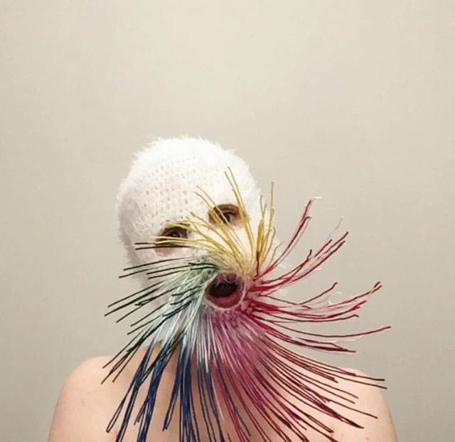
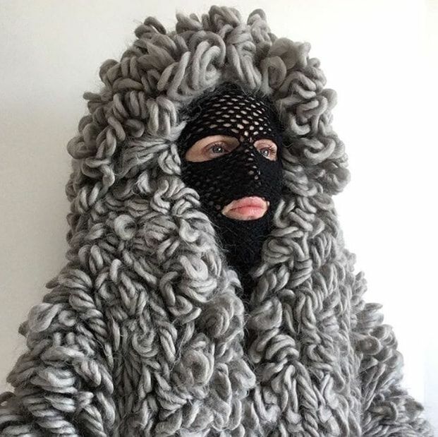
The artist that inspires me the most I found was one that calls herself "Threadstories." She is from Ireland and works to make pieces out of yarn and sometimes other textiles. Her creations are colorful, abstract pieces that cover most of the face.
Her instagram is www.instagram.com/threadstories/?hl=en Her work is the main reason I had chosen her, but as I read more into detail on what her pieces were supposed to represent I fell in love with that, too. First off, her head pieces really grab your attention as soon as you have seen them because of their uncommon shape and vibrant colors. They are very creative and unlike I had ever seen before. If I had not saw what she did, I wouldn't of ever thought that this type of art was a thing. Also, her pieces actually have a deeper meaning other than of that just to be visually pleasing. Threadstories claims that her artwork is meant to "deny the viewer of the full story of who the sitter is, echoing the curated or false personas we portray and view online daily." She also says "the masks are mutations of our private and public selves." I believe that not only is her art amazing but so is her reason on making it; not a lot of people actually do anything to break down the expectations that are set for people by the internet.
|